Qoo10 - Screen Readjustment
About this Project
This School Project was to remake certain parts of the current Qoo10 application to be less jarring to the eye in terms of load on the user.
Many users use Qoo10 as an online commerce platform, and improvements had to be made so the user experience could be smoother. This was mostly achieved by drastically reducing load on certain key screens.
Font: Arial
Aa Bb Cc Dd Ee Ff Gg Hh Ii Jj Kk Ll Mm Nn Oo Pp
Qq Rr Ss Tt Uu Vv Ww Xx Yy Zz
1 2 3 4 5 6 7 8 9 0
Colors
#F74F5C
#FFFFFF
Design Process
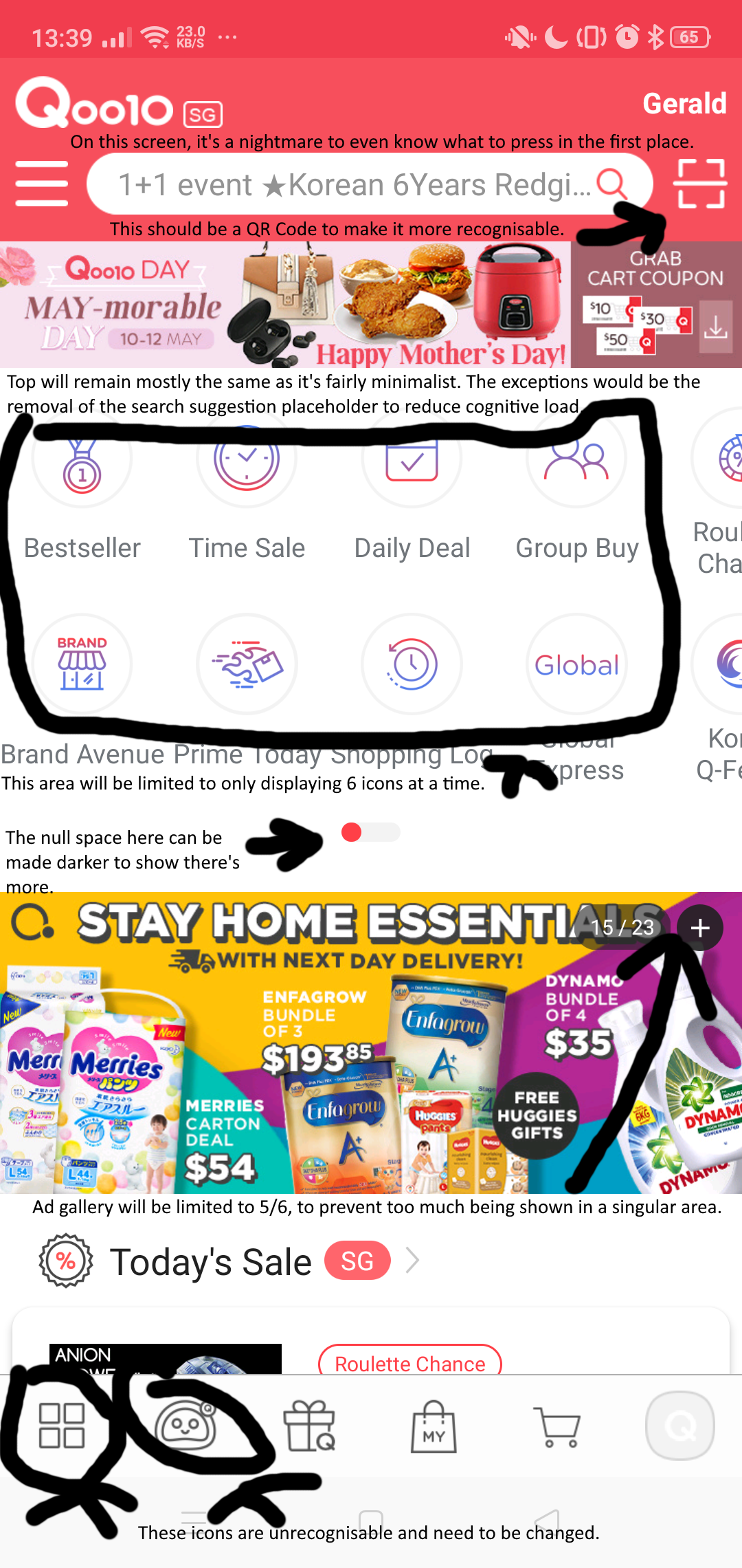
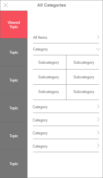
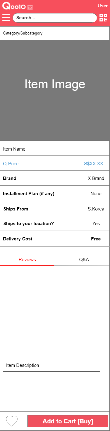
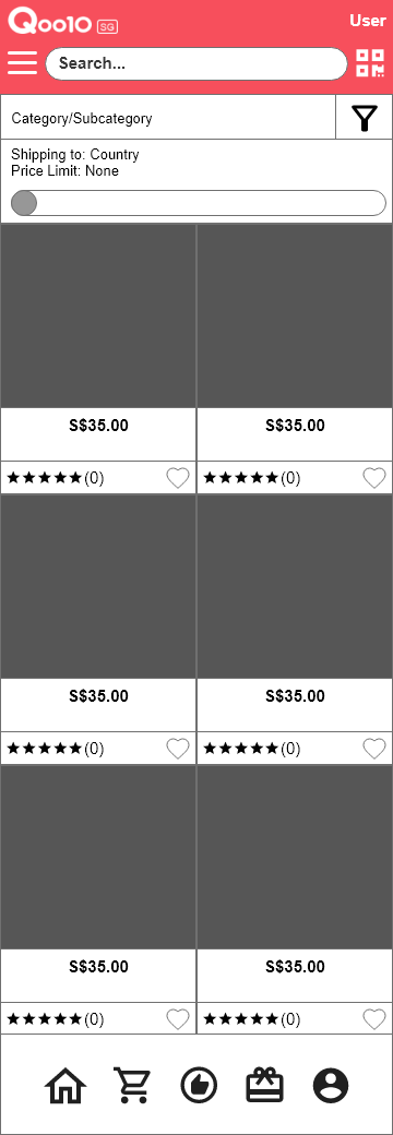
Qoo10 has many issues with its screens right now, such as the over cluttering of content.
This usually causes confusion to users who are trying to use the app for the first time.
Product Search pages are usually too cluttered for users to really find what they want.
Over time, it will frustrate the user to the point where they stop using it.
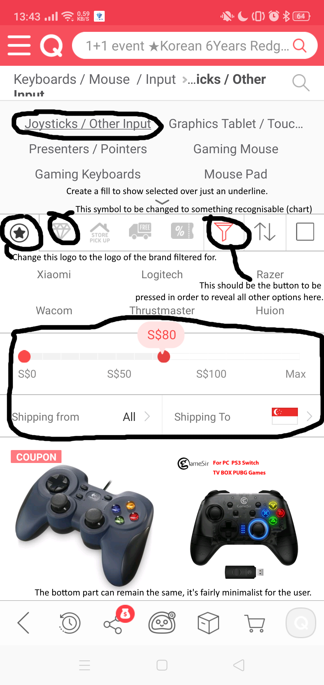
Screens